Guide to HubSpot’s new navigation
Author
Tips for you to get the most out of HubSpot’s new navigation when it goes live May 14.
On May 14, HubSpot will switch all users to a new navigation system. The Inflectiv team has been trialing the new HubSpot navigation for weeks, and here are some tips for you to hit the ground running when it goes live.
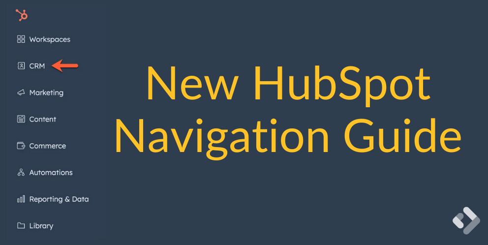
Goodbye top menus, hello sidebar
The familiar Contacts, Conversations, Marketing, etc. menus at the top will disappear. Instead, they will be replaced by a sidebar with new headings and icons. Your HubSpot data has been re-shuffled to reflect how HubSpot has grown, and account for where it is going.
We like the change overall, but you should expect a learning curve.
Here is a breakdown of the new navigation:
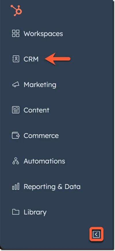
- Click the CRM icon to get to contacts, companies, deals and tickets. Other core things, such as lists, inbox, calls and tasks, are included here. If you are using custom objects they now appear here – a big plus!

- The Marketing icon now hosts campaigns, email, social, ads, forms and CTAs. It’s not too different from before.
- The new Content section includes website and landing pages, blogs and embeds. This is a bit of a catch-all, with knowledge base, customer portal, SEO and memberships showing up here too.
- The Automations icon now includes chatflows and surveys alongside workflows and sequences. If you haven’t checked out surveys, we definitely recommend it.
- The Library icon now gets you to templates, meeting scheduling pages, files, documents, snippets and coaching playlists. This makes good sense to us.
- Reporting & data covers what you’d expect, finally all brought together in one place.
- Workspaces is a new way to find the new-ish Prospecting and Help Desk features, while Commerce covers quotes, payments, invoices, products, subscriptions and more that HubSpot is focusing on lately. Note that products are here now.
It’s worth noting that Target Accounts can only be found by navigating to the company.
It’s notable that the new nav bar takes up a lot of space by default. That can really squeeze things like section headers in the left column of a record. We recommend you click to hide the sidebar menu; it will expand when you need it.
Just remember that change is hard. If you invest some time now to understand how things have changed, it will make you that much more efficient when you need it.
See here for a HubSpot article about the new navigation, and reach out if you need any help getting the most out of HubSpot.